

ROLE
UX Designer, User Researcher
RESPONSIBILITIES
Client meetings lead, Contextual inquiries, User interviews, Affinity Mapping, Persona creation, Sketches, Text field design, Interaction prototyping, Usability testing, Final design iterations and prototype
PROJECT OVERVIEW
PimsPoints supports parent / caregiver engagement in a child’s education through an incentive-based program. The purpose of this project was to enhance the onboarding and registration process for parents / caregivers. I collaborated with a team of two for all research and design aspects. The platform for this project is a mobile application.
PROBLEM
PimsPoints current onboarding and registration lacks clarity.
Users are uncertain about the purpose of PimsPoints during sign-up. As the user moves through the registration certain information being requested feels unnecessary and text prompts are confusing.
SOLUTION


Design a clear, guided process to sign-on with PimsPoints.
Our design features a visual and informative onboarding experience followed by a streamlined registration process that requests necessary information only through the use of clear, direct prompts.
SOLVING THE PROBLEM
How can PimsPoints gain user confidence when joining?
Preliminary research
Competitive analysis provided insight into task flow and feature prioritization which guided early design decisions.

Contextual inquiry
Five contextual inquiries were conducted with parents / caregivers of young children using the current app registration process to gather constructive feedback.

Affinity mapping
Insights and themes were gathered and provided a better understanding of the user’s needs and preferences.

KEY INSIGHTS
Based on the research, we found a few key insights.
The current sign-on lacks clarity of PimsPoints purpose.
“Sometimes when you are signing up you just need to get it done. I am trying to hurry through.”
“It is a registration process, but I am getting ahead of myself, what am I registering for?”
Certain text field prompts cause hesitation on the information needed.
“When you are signing up for a school, it can be confusing if it is your account or if you are supposed to put in their (child) information.”
The registration process feels time consuming.
PRIMARY PERSONA
We defined our primary persona to guide us forward.

Meet Sophia
“Sometimes when you are signing up, you just need to get it done.”
37. Married. Mother of two.
Sales Rep. Atlanta, GA.
GOALS
To be more involved with her children and their school life
To build relationships with teachers and staff at her childrens’ school
To be sure her husband is also able to stay connected
FRUSTRATIONS
Her work schedule varies from week to week
In the past she hasn’t consistently received information from teachers about upcoming school events.
There is no convenient way to know how she can participate at her childrens’ school
INITIAL DESIGN
We ideated and sketched together (x2) before creating low-fidelity wireframes.


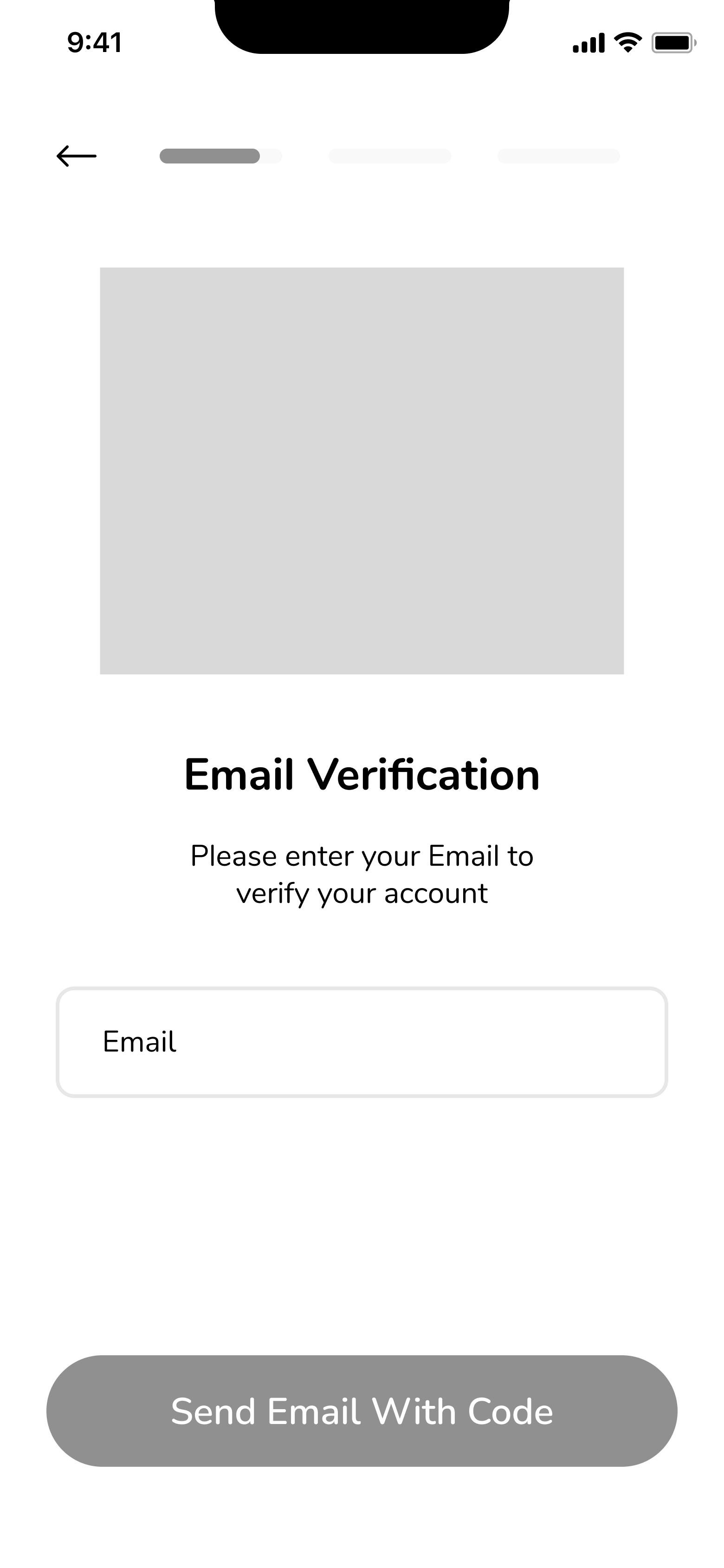


From start to end, we focused on an intuitive flow: enter the initial required information, verify email, provide account details, option to invite family members, and add a child. Our client provided feedback and we created a prototype for usability testing.


TESTING + FEEDBACK
All users enjoyed how streamlined the sign-on was and feedback was provided for improvements.

Onboarding confusion
Design iteraton. Included visuals of in-app features to increase user understanding of PimsPoints.

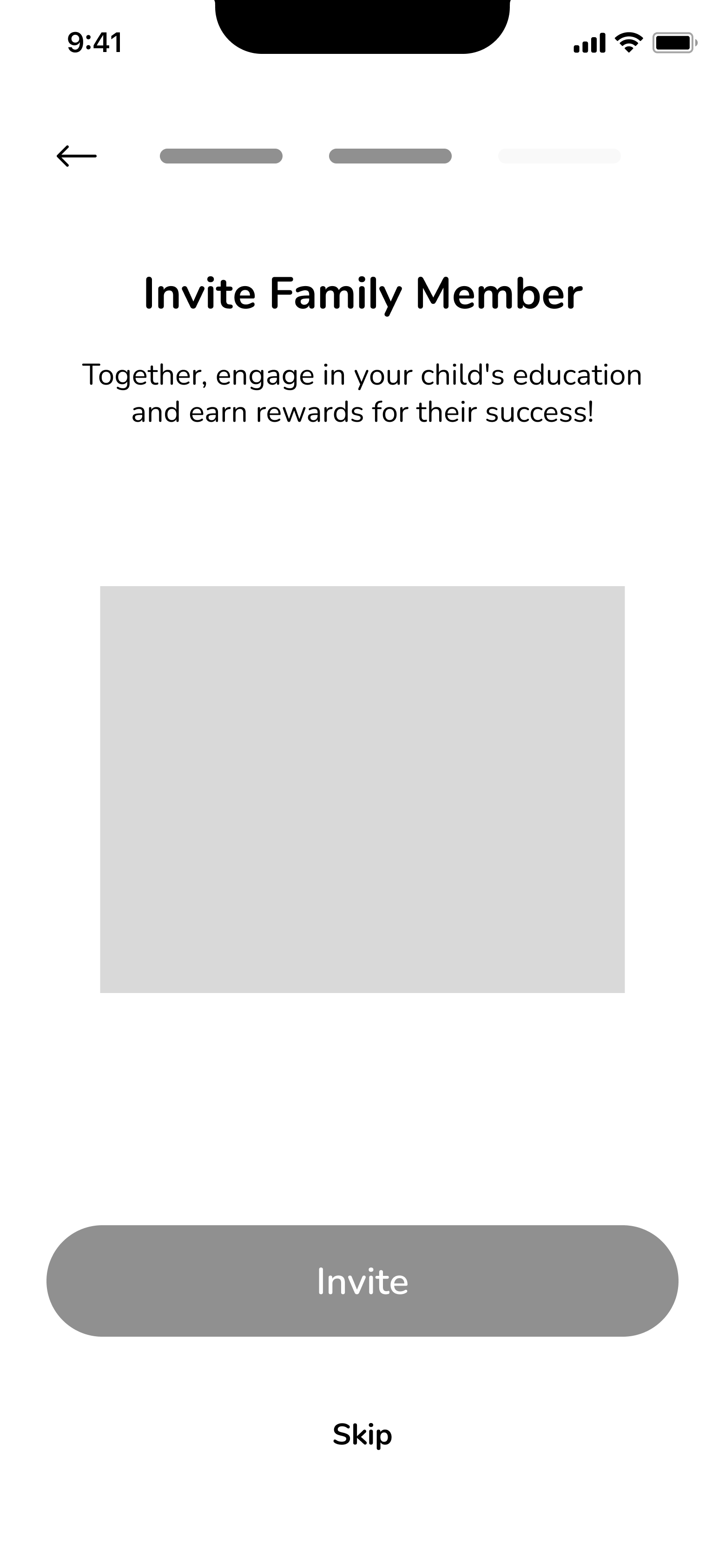
Task flow uncertainty
Design iteration. Users were uncertain why “Invite Family Members” interrupted the sign-up flow and felt it should be at the end.

User preferences
Design suggestion. Users prefer text verification for mobile, as well as optional profile picture.


We created a visually appealing onboarding process that gives a brief introduction to each of PimsPoints three major user types: parents / caregivers, community partners, school staff.
FINAL DESIGN

Our final design highlights the iterations made based on feedback.

By including a language drop-down menu we provided accessibility to non-English speakers.

We prioritized inclusivity by considering and utilizing illustrations and icons sensitive to a variety of users.

Since users indicated a preference for optional profile pictures as a privacy feature, we provided the option to skip, as well as outlined information on the picture being changeable and protected by linking terms of agreement.
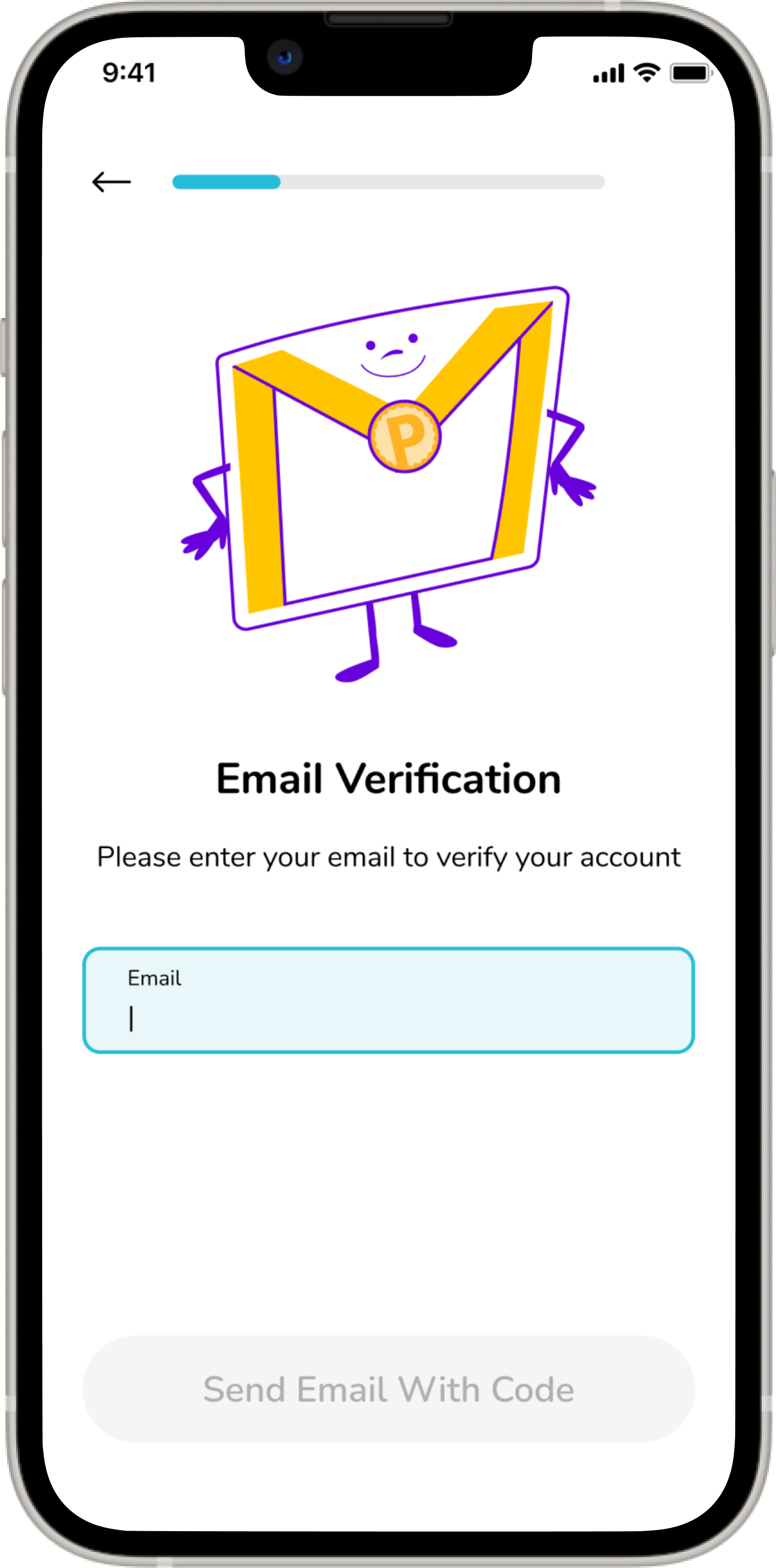
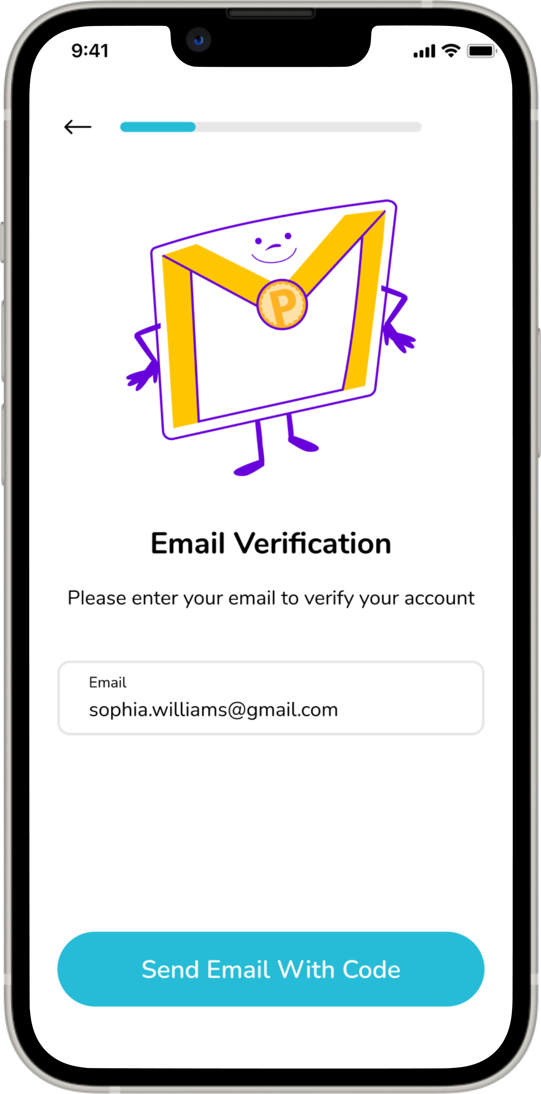
We clarified and simplified the language on text field prompts and visually designed the input box to change as the user selects it and enters information. By highlighting the CTA button when all necessary information is provided, the user knows to continue to the next screen.


Our final flow features a more streamlined process of inputting only necessary information from start to finish. Once the user completes their registration, they are able to invite family members if applicable.

We reduced ambiguity at the end of the sign-on by letting users know exactly what to expect for next steps and topped it off with a touch of celebratory confetti!
Here is our final prototype. User approved, client appreciated.
PROTOTYPE
LEARNINGS + NEXT STEPS
This project felt like an accomplishment.
What I learned
When this project started, we were a team of four, but when it ended we were a team of two. This required flexibility as the workload shifted. Taking the lead on this project, I maintained contact with the client, at times needing to share the setbacks with the timeline while maintaining the relationship.
Where I’ll go
I enjoyed working on a mobile application and would love the opportunity to work on mobile again. It is a small screen size, so it provides many opportunities for creativity in highlighting only the necessary information and doing it well enough not to overwhelm the space.